

ROLE
Graphic Design
Brand Identity
Marketing
Branding
UX/UI
Prototype
DATE
2023

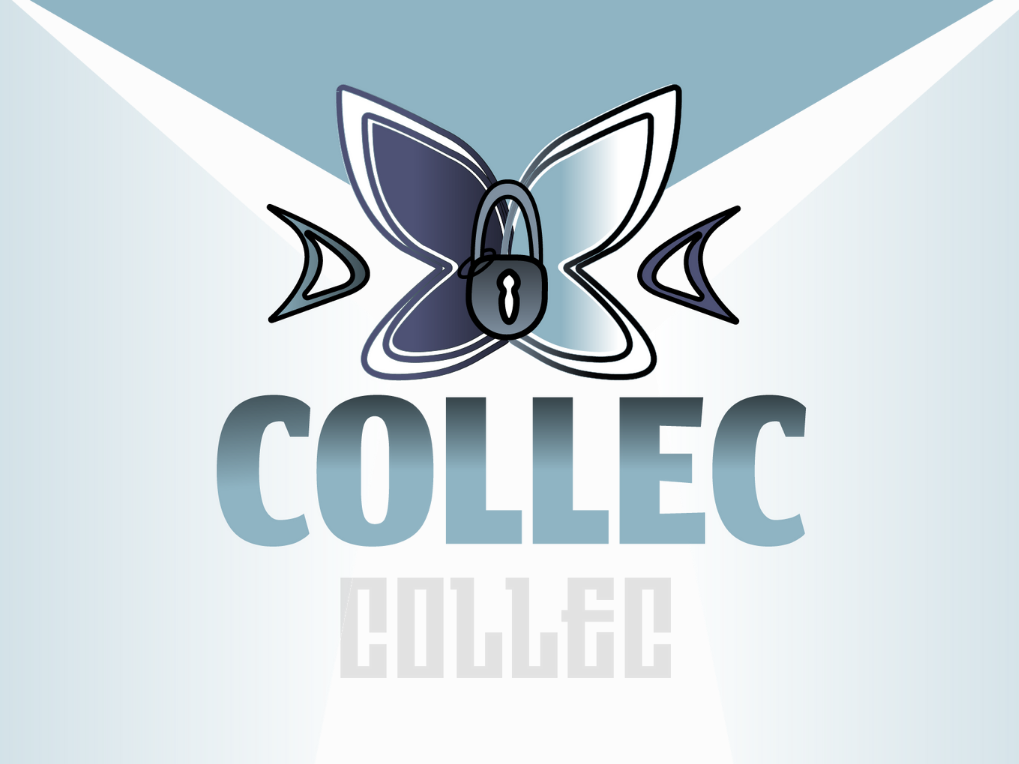
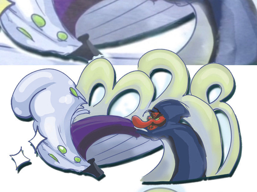
For a design project, we needed to create a brand identity guide and campaign for a company. I decided to create a campaign for an aquarium business that specialises in shrimp care. Patience, Growth, and Prosperity is what this company likes to be known as, considering that aquascaping necessitates these core characteristics in order to produce a thriving tank. A good flourishing tank requires a sense of balance and care to make something flourish, and this business wants their logo to represent that.
This fresh perspective resulted in a far more appealing and eye-catching company identity that stands out and, ideally, generates a friendly environment. I designed a primary logo and brand guide to be used in conjunction with the other aspects. I picked the typeface and colour palette, both of which I felt complemented the feeling the client was going for with NEOCare and the key principles. By utilising the brand design, all of these materials would express the charm and uniqueness of what NEOCARE is.


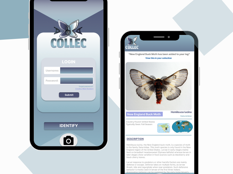
After Creating the Brand Identity guide and Brand Styles, I wanted to take it a step further and create an app focused around an aquarium online platform.
Rounded UI Elements are an excellent method to emphasise the depth of this app. The use of muted hues favours the application that will mostly consist of photos. It compliments the structure of the design without detracting from the complex graphics that will be the app's main emphasis. This can help find incompatibilities with design choices early in the process, which helped my approach.
My main user flow walks you through the NEOCare shop's main screen, as well as how to add an item to your basket and check out. This app focuses mostly on the shop as well as its customers who utilise this platform to exhibit their tanks and goods.